
This is a legacy form building tool and will not be supported or updated in a future product release. For a fully supported form building tool, we recommend using the Forms & Workflow (OpenForms) platform. For more information, see our article on connecting Forms & Workflow with this CMS and the Forms & Workflow help centre.
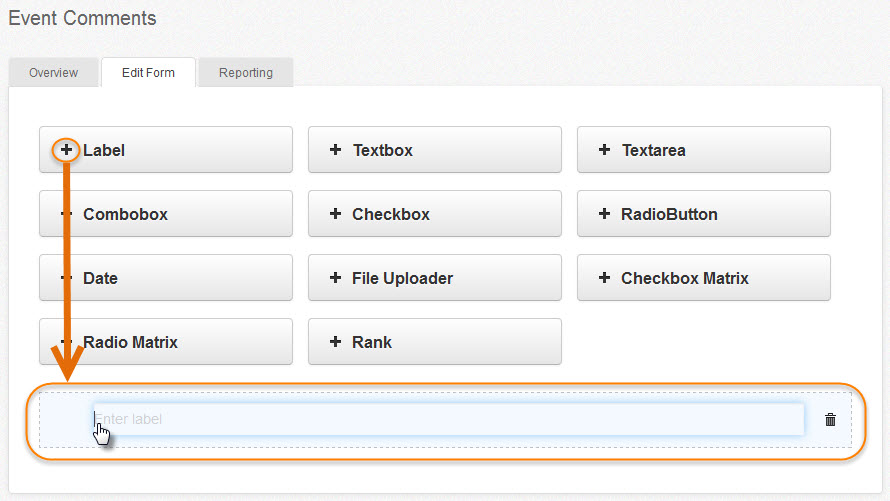
Use the appropriate field type to create your form questions and collect response data. To select an input type, click on the + symbol, and the field will appear below the input type area.
- Label field
- Textbox and Textarea fields
- Combobox field
- Checkbox and Checkbox Matrix fields
- RadioButton and Radio Matrix
- Date field
- File upload field
- Rank
Label Field
Used to create section headers within the form. As the form is entered into the WYSIWYG page area, content can be added around the form. The label field is used to title sections within the form itself, e.g., Section 1 - Contact Details, Section 2 - Employment Details, etc.
Enter text by placing the cursor directly into the field. No response is required.
Textbox and Textarea Fields
This field allows the respondent to respond using text.
- A Textbox input field is used to provide short, one-line answers.
- A Textarea input field is used for longer answers (paragraphs), allowing more response space to enter and review text.
Place the cursor in the label area to enter the question text, then click on the pencil icon to the left to edit the field properties.
Field Descriptions for Textbox and Textarea
- Value: Predefined value added to the response box.
- Required field: Assign this as a mandatory field. If selected, ensure you fill in the Validation message field.
- Number: Check Yes so that this field will only accept numeric characters.
- No. of decimal: Number of characters accepted for this field.
- Email: Check Yes so that this field will only accept characters configured as an email address.
- Respondent: Appears if Email is selected, to identify field as the Respondents email address. This is the address used for the Autoresponder message set up in Submission.
- Max length: Number of characters accepted for this field.
- Regular expression: Code used to set the input response pattern. It is used to specify a set of strings or a character configuration for a particular purpose, e.g., a request ID 'ABCD-1234' can be coded to only access the configuration of 4 letters, a dash, and 4 numbers.
- Validation message: Appears after form submission attempt to advise the respondent that they have not filled in a required field correctly. The form will not be submitted until they have satisfied the field response requirements, e.g., mandatory field not completed or text used when the field has been set to only accept numbers.
- Description: Overview of field for internal use.
After completing the settings, click Update to save and condense the settings window.

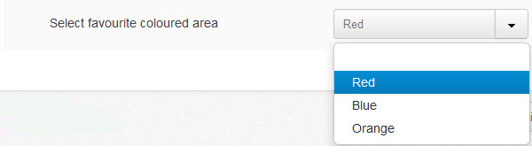
Combobox Field
Create a list of selectable drop-down options.
Field Descriptions for Combobox
- Required field: Assign this field as mandatory.
- Graph: Allows you to represent the results as a pie or bar graph in the Reporting tab.
- Validation message: Message displayed to advise the respondent that they have not filled in this required field (if assigned).
- Description: Overview of field.
- Options: Set up the drop-down options by inserting "Text" displayed on the screen and the default "Value" of the field. Tick "Selected" if you want this item pre-selected by default. Click "Add" to create more options. To delete, use the settings drop-down to the right of the field, and to rearrange the options, drag and drop them using the move item icon to the left of the field.

Combobox Display in Live Form
Checkbox and Checkbox Matrix Fields
The Checkbox input type allows respondents to select multiple results from options using tick boxes. Settings are configured as per combobox.
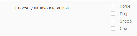
Note: Settings screen options are the same as those in the Combobox above.
Using the Checkbox field allows multiple results to several set questions, so the respondent can choose more than one option to answer the question.
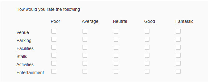
Checkbox Matrix
The most common use of Combobox Matrix is to provide various ratings for the quality of a service or experience.

Checkbox Display in Live Form
RadioButton and Radio Matrix
The Radiobutton field works the same as the Combobox but only allows respondents to select one result from a group of options. The Edit field properties or settings are the same as Checkbox and Checkbox matrix.
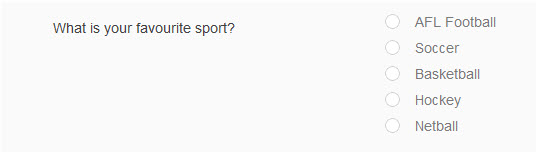
The Radiobox field option allows only one result for several set questions. The respondent can only choose one option to answer the question.
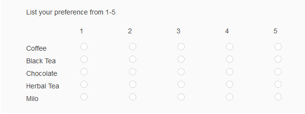
Radiobox Matrix
The most common use of Radio Matrix is to provide definitive answers to questions about the quality of a service or experience from preset options or levels.
The settings screen options are the same as the Checkbox Matrix.
Date Field
The date field allows respondents to enter a single date from the calendar widget.
The settings for the Date field allow you to set this as a required field and the date period available for the respondent to choose a single date from the calendar. If either is set, make sure a validation message is used to explain these rules.

Date Display in Live Form

File Upload Field
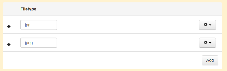
The File uploader allows the respondent to add files to the form submission. In the settings, the file uploader can be assigned as a required field, as well as the maximum file upload size and the specific file types permitted to be uploaded.
If any file is available for upload, leave the file type as is (with a * only). If you want to allocate a list of accepted file types, put the file type extension in the Filetype field and click Add to include additional filetype if required.
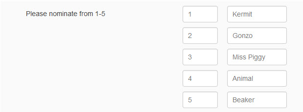
Rank
Allows the respondent to rank order to a list of options.
This option can be assigned as mandatory (requiring a validation message) and internal description. Options are configured in settings, and display with a number field beside it identifying, the options position number in the list. Fields can be dragged to different positions in the list if desired. The rank or position number can be changed by the respondent in the live environment.
Rank Display in Live Form